Home

Sweet Spring: Melissa & Mike


Spring is in the air! I personally love spring weddings. In Michigan however because of stretching winter and unpredictable weather majority of the brides and grooms turn away from picking late March or April dates. We have helped Melissa and Mike design a perfect spring wedding for them. Picked color palette was blush/peach and mint with quite a bit of champagne. Melissa wanted everything matching so simply, we made everything matching! We spiced up entire look by the use of funky chevrons patterns and succulents. We had some sparkles with some of the blush/gold sequence linens. Our spandex chair covers decorated with shimmery diamond bands gave entire room at Cherry Creek more refined look. Menus were printed on mint paper that pulled the mint color thru all the tables. And if you noticed below, beautiful favor macarons were two different primary colors and made an exquisite, sweet touch to all the place settings. At the end Melissa and Mike had a gorgeous spring day. So it is possible to have a gorgeous spring wedding in Michigan! We wish both Melissa and Mike many years of happy marriage. 


Below are few photos taken by Dmitriy from DSP Fotographie documenting the big day.


And our gorgeous bride and groom.


Photographery: DSP Fotographie
Flowers/Linens/Chair Covers: Goizzy
 

Pin It Now!

Agnieszka & Michal: Orange challenge!

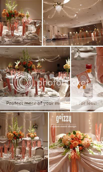
Few years back I remember smaller weddings were really popular but recently weddings over 200 people are considered norm. With Michal and Agnieszka I had a chance to plan their smaller wedding which was really fun to do for a change of paste. Venue that our couple picked was not a traditional choice. For one, our couple couldn't have over 150 guests so they really needed to do some work on trimming their guest list. Fiddler's very European style of set up, of long communal tables and multi-course dinner make this venue really popular amongst local Slavic community. As for the look, reception room is painting with a pretty vibrant orange which really can overpower any color palette and is quite challenging to work with. Agnieszka wanted to compliment the room and we decided on blush tones with light orange/peach accents. Our color choices softened the look and gave it warm summer wedding feel. Why fight the colors when you can make them work? It was a gorgeous summer day where our couple really took advantage of the sunny weather and captured with Agnes Photography some great shots.


Here is Agnieszka's white, blush and peach bridal bouquet.


Below shots documenting entire day are taken by Anges Photography.


Venue: The Fiddler
Ceremony: St. Florian
Table Number Design: Goizzy
Photographer: Agnes Photography
Flowers/Linens/Draping: Goizzy

Pin It Now!

Juliya & Sergey

July 30, 2010


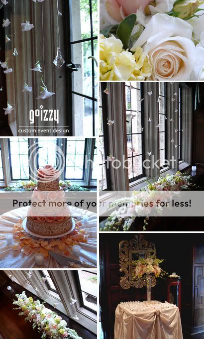
Two weeks ago, we had a wonderful Friday wedding in the Pine Knob Mansion. Just to mention right up front, if you are from Metro Detroit area and if you haven't been there yet, do yourself a favor and get out there! It's beautiful, it has history and going there is an experience. I look forward my future weddings in there. My wonderful clients Juliya and Sergey had an outdoor ceremony in their gardens and the reception was of course in the mansion. We were hired by Juliya's mom to decorate the "cake room" and the front hallway as well as do few details. As soon as I got familiar with our space, I had a vision in creating very "princess like" look. We wanted the cake to pop and the window behind the cake to add to the viewing experience. Juliya wanted a lot of champagne colors, including blush pink just for an extra touch. We added blush roses in between cake layers for it to really stand out. We had really great time in there, loved working with a unique space and loved bringing my vision to life. Juliya and Sergey had a wonderful time, they looked beautiful. Congratulations to both of you.


Pin It Now!

Marta & Tom

June 19, 2010


I have to be honest with all of you. Because our June had been so busy this year I really had hard time keeping up with my posts. Here is another wonderful wedding. This one was 100% Polish. I worked for the past few months with Marta and Tom on getting their ideas together and finally bringing them to light. Marta loved the warm look of the wedding that I have done in 2008 with very similar colors. Peach was supposed to be the dominating color of the wedding. That was a good start and since I never replicate anything exactly twice it was another challenge for me to create something similar yet different. We picked champagne chair covers and linens just like last time. Yet these had different texture. Sashes on the chairs this time around were satin peach. About month before the wedding Marta has given me the color of the bridesmaids dresses. They weren't peach but they were burnt red/orange shade. It was an addition of a color that till that time we never spoke about. Two weeks before the wedding I saw wonderful invitations that Anna from Paperie Design Studio designed for Marta and Tom and they were neither peach or burnt red/orange shade that the dresses were. They were beautiful apricot shade! I didn't want to exclude any of those colors in the hall because I wanted all these shade come to life when you walked into the room. I was lucky enough actually to order three different types of roses that were exactly those shades. From far away flowers on the tables looked peach but when you looked up close they had peach, apricot and burnt red/orange colors. Everything really came together and hall looked extremely warm. Marta and Tom had a wonderful wedding and they looked beautiful. Gratulacje!


Above are few teaser shots of our wonderful couple taken by Agnes Photography.

Pin It Now!

Marianne & Scott

June 05, 2010


I was excited about Marianne's wedding for quite a while already. As soon as I found out colors that she picked out I knew it's going to be original. Fun fact is that actually tiffany blue and peach were picked to be the 2010 wedding colors.
For spring/early summer wedding those two shades really complement each other well. They look fresh, happy and aren't oftenly used. As you can see on my photos below, we had tiffany blue linenes, white pillowcase chaircovers with tiffany blue sash. Flowers were relatively simple yet they had enough of peach color in them to stand out. Cake was beautiful and and in those quite large boxes on the tables were its minature imitations out of white chocolate. Marianne and Scott looked beautiful. Congratulations to both of you.

Below are few photos taken by Marianne & Scott's photographer, Corinna's Camera.

Pin It Now!